Key points about watermarks in digital asset management
- Visible watermarks are best for deterrence and branding; invisible marks are better for traceability.
- Image watermarks usually work best as corner logos, faded names, diagonal text, or repeating overlays.
- Document watermarks often communicate status, such as DRAFT, CONFIDENTIAL, DO NOT COPY, SAMPLE, or APPROVED.
- In DAM, watermarking should sit alongside metadata, permissions, and version control, not replace them.
- The safest workflow keeps master files clean and applies watermarks to previews or external renditions.
- Weak watermarks are usually too small, too busy, or applied at the wrong stage of the process.

What watermarks actually communicate
I treat a watermark as a signal, not a shield. It tells the viewer something useful in seconds: this file belongs to us, this one is only for review, or this version is not ready to circulate yet. That clarity matters in DAM because assets rarely stay in one place; they move from editors to stakeholders, from internal folders to client review links, and from one channel to another.
The key is matching the mark to the decision the viewer has to make. An ownership mark helps on images, a status mark helps on documents, and a distribution mark helps when the file leaves the library. Once that distinction is clear, the image side becomes easier to design and the document side becomes easier to standardise.
Watermark examples on images that make sense in DAM
For images, I usually aim for a watermark that is visible enough to deter casual reuse but light enough that the asset can still be reviewed properly. A preview image should not feel destroyed by the protection layer, and a portfolio shot should still let the viewer judge composition, colour, and subject matter.
| Example | Best use | Why it works |
|---|---|---|
| Small logo in a corner | Public previews and portfolio images | Identifies the source without blocking the main subject. |
| Faded brand name across the centre | Stock proofs and selection galleries | Stays visible in screenshots and discourages casual reposting. |
| Diagonal translucent text | Pre-release stills and client comps | Harder to crop out and easy to recognise at a glance. |
| Tiled repeating pattern | High-value images and contact sheets | Much harder to remove without damaging the image itself. |
| Signature or monogram | Personal brands and photography portfolios | Feels less corporate while still marking ownership. |
My usual starting point is a subtle mark rather than a heavy overlay. If the image is meant to be inspected closely, I keep the contrast low and place it where it does not collide with the subject. If the file is likely to be screenshotted, redistributed, or scraped, I make the mark harder to crop. The wrong choice is usually obvious after one test export: either the watermark disappears, or it steals too much attention from the asset itself. Documents need a different treatment, because the goal is usually status rather than visual branding.
Document watermark examples for drafts and approvals
Document watermarks are often more operational than artistic. They are there to help readers understand whether the file is final, restricted, or merely a working copy. That is especially useful in review cycles, procurement, compliance, and legal document sharing, where one mistaken export can create avoidable confusion.
| Watermark text | What it tells the viewer | Typical placement |
|---|---|---|
| DRAFT | The file is still changing. | Diagonal across the page or in the header/footer. |
| CONFIDENTIAL | Circulation should be limited. | Whole page or repeated on every page. |
| DO NOT COPY | The file is not meant for redistribution. | High-contrast text in a visible central position. |
| SAMPLE | This is a demonstration copy. | Cover page, preview PDF, or exported sample pack. |
| APPROVED | The content is ready for release. | Corner placement or footer, depending on the template. |
| INTERNAL USE ONLY | The file should stay within the organisation. | Every page when the document is routinely forwarded. |
For documents, placement matters almost as much as the wording. A one-page cover watermark may be enough for a short review deck, while a contract, policy file, or specification often needs the mark to repeat throughout. I prefer document watermarks that are obvious on a phone screen as well as on desktop, because that is how most approvals get checked now. Once those files are inside a DAM, the watermark becomes part of a controlled distribution process rather than a one-off formatting choice.
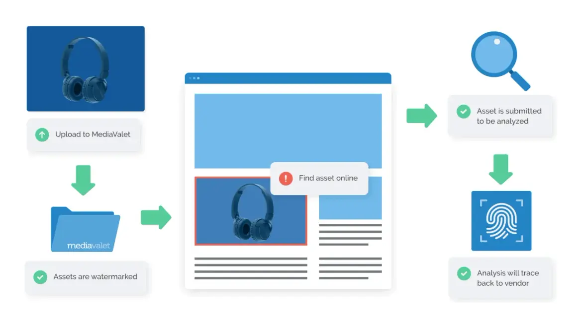
How watermarking fits into a DAM workflow
A DAM system works best when the master asset stays clean and the protected versions are generated from it. That keeps the source file usable for future edits while giving you watermarked renditions for previews, proofs, or external sharing. In practice, that means watermarking should be tied to the export stage, the audience, or the asset status, not applied casually to the only copy you have.
- Keep the master file unwatermarked and store it with full metadata.
- Generate separate renditions for internal review, client approval, and public sharing.
- Attach usage rights, licence terms, and expiry dates to the asset record.
- Use a consistent watermark asset so the library does not drift into mixed styles.
- Link watermark rules to roles or workflow stages instead of relying on manual decisions.
- Log which rendition was shared, especially for high-value images or video stills.
Adobe Experience Manager, for example, lets teams apply a PNG watermark stored in the DAM and scale it relative to the rendition width, which is a practical reminder that the mark itself should be treated as managed content. I like that approach because it keeps the branding layer separate from the source asset and makes it easier to update the mark centrally if the policy changes. The next step is choosing the right style, because not every asset deserves the same treatment.
Choosing the right style for different asset types
I usually split the choice into three questions: how sensitive is the asset, how likely is it to be shared, and how much should the watermark affect the viewing experience? If the answer to the first two questions is high, I lean towards a stronger visible mark or a forensic approach. If the asset is mainly for review or presentation, I keep the mark light and readable.
| Style | Best for | Strength | Weakness |
|---|---|---|---|
| Visible text or logo | Marketing previews and social assets | Easy to see and simple to deploy. | Can be cropped or edited if the viewer is determined. |
| Invisible or forensic marking | Premium images and video dailies | Supports traceability and provenance. | Needs system support and is not obvious to the viewer. |
| Status watermark | Drafts, contracts, policy documents | Clarifies use very quickly. | Does not stop copying on its own. |
For image libraries, visible marks are usually enough when the real goal is deterrence. For higher-value content, I would add better access control, permissions, and metadata rather than making the watermark do all the work. That is even more important in AI-era asset libraries, where provenance and usage context need to travel with the file. A good style choice should protect the asset without making every preview feel hostile.
Common mistakes that weaken watermarks
Most weak watermarks fail for boring reasons. They are too small to notice, too faint to survive compression, or placed in a corner that gets chopped off during a simple crop. Another common mistake is watermarking the wrong file stage: teams protect the only master they have, then discover they can no longer produce a clean version for print, licensing, or archive.
- Using the same mark on every asset, regardless of audience.
- Making the watermark so subtle that it disappears on mobile or after compression.
- Placing it where it can be removed with one crop or logo cut-out.
- Applying it to the master instead of the derivative or preview.
- Ignoring metadata, licence terms, and permissions.
- Assuming the watermark alone will stop deliberate misuse.
The UK Intellectual Property Office makes the useful point that watermarking can deter casual theft, but it is easy to remove or crop out if someone is determined. That is why I always treat metadata as the stronger proof layer and the watermark as the visible warning. The final step, then, is not more decoration; it is a workable policy.
The watermark policy I would use for a UK content library
If I were setting this up for a UK team, I would keep the policy simple enough that people actually follow it. The point is not to create a perfect mark for every scenario. The point is to make the right version easy to identify and hard to misuse.
- Store clean masters in the DAM with complete metadata.
- Generate watermarked previews for review and external sharing.
- Use a subtle brand mark for public image previews and a stronger status mark for draft documents.
- Reserve diagonal or tiled overlays for higher-risk assets.
- Apply watermarking automatically at export so the team is not deciding file by file.
- Review the rules whenever the content moves to a new channel, partner, or approval stage.
The simplest test I use is this: if the watermark helps the viewer understand how to use the file in under two seconds, it is doing its job. If it distracts from every other task, it is too aggressive and belongs on a lower-trust rendition instead.